SERDC is excited to announce that we have rebranded! This initiative marks a new chapter for us, and we would like to thank and honour the previous logo for serving as the visual identity of our organization for over four decades.
Embracing the winds of change, SERDC decided it was time to redefine its aesthetic.
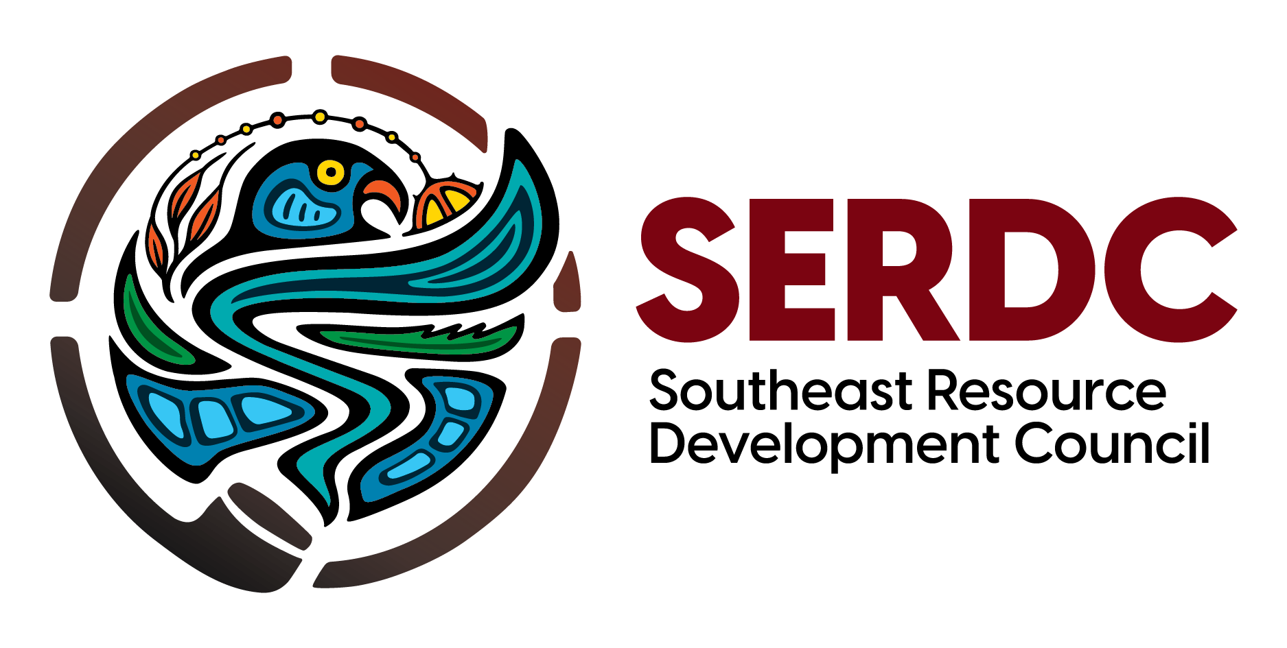
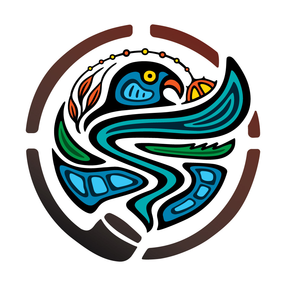
The new logo, crafted by artist Shaun Vincent of Vincent Design Inc., brings a fresh and modern look to SERDC's presence.
Vincent Design has a reputation for leading in Indigenous graphic design in Manitoba and across Canada. Some of their notable work includes projects like the Southern Chiefs’ Organization flower motif (as seen on The Bay building downtown), the Protect Our People COVID-19 vaccine campaign, and the Survivors flag for the Every Child Matters movement; this just scratches the surface.
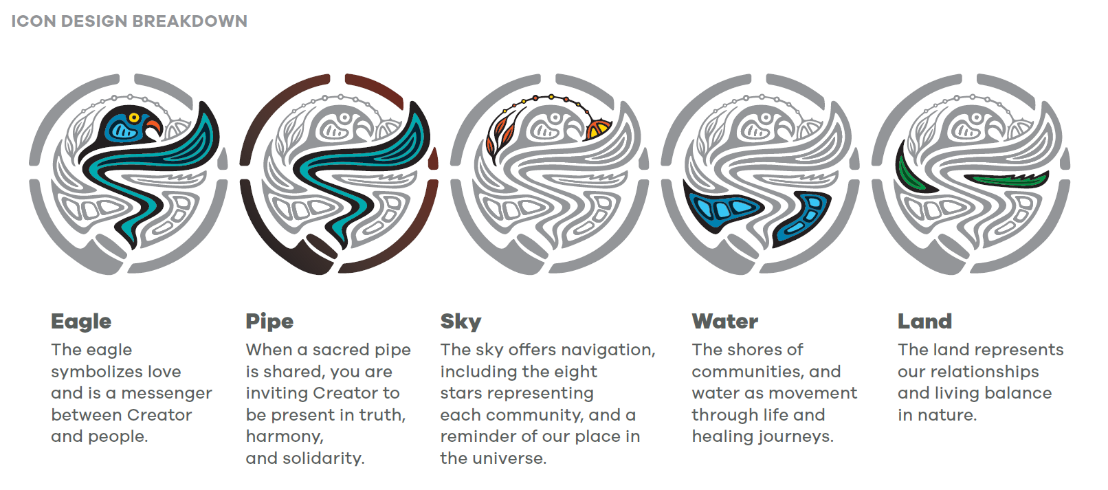
The design is an intertwining of five elements: the eagle, the pipe, the sky, the water, and the land.
SERDC's dedication to fostering economic growth and development while preserving the values and traditions of the region was at the forefront of this design.
As SERDC moves forward with its rebranding efforts, the new logo will be prominently featured across various communication channels. This fresh visual identity will help to create a cohesive and recognizable brand presence for SERDC, supporting effective engagement with stakeholders and community members.
A Bridge Between Tradition and Tomorrow
The amalgamation of the five logo elements symbolizes a bridge between tradition and the future—a depiction of honouring our cultural roots while embracing progress.